To people living in the Nordic countries few things compare with the first days of spring. The air smells different. The morning light appears almost dusty as the sun moves slightly higher in the horizon during the day - and though it is not positioned sufficiently high to warm the air, its rays have gained enough power to warm any surface that catches the sunlight, sending a message that cannot be misunderstood; spring is coming! It is a magical time, a time full of anticipation of the change just around the corner. Grasses, bushes, thickets and trees slowly wake up to a feast of light and warmth that have been truly missed through the darker months. Growing up in the Danish countryside, Simonsen closely observed the rhythm of nature - the silent neighbours on his doorstep. Laying in the tall grass from a young age, watching the clouds float by and witnessing how the light changes the landscape from early dawn to late dusk, would influence his artistic career for decades to come.
Simonsen is a keen storyteller, and nowhere does it become more apparent than when he indulges the viewer in a series of work covering the same scenery at different points in time. Narrowly defining the cycle allows him to bring a multitude of colours to the surface, each invoking unique emotions, showing them as they are reflected intensely on his principal subject; the botanical world.
Magenta,
Ochre and
Scarlet are a skilful example of this style. In these works, colour plays the lead and poetically portraits the landscape from his childhood during the beloved summer months.
HENRIK SIMONSEN
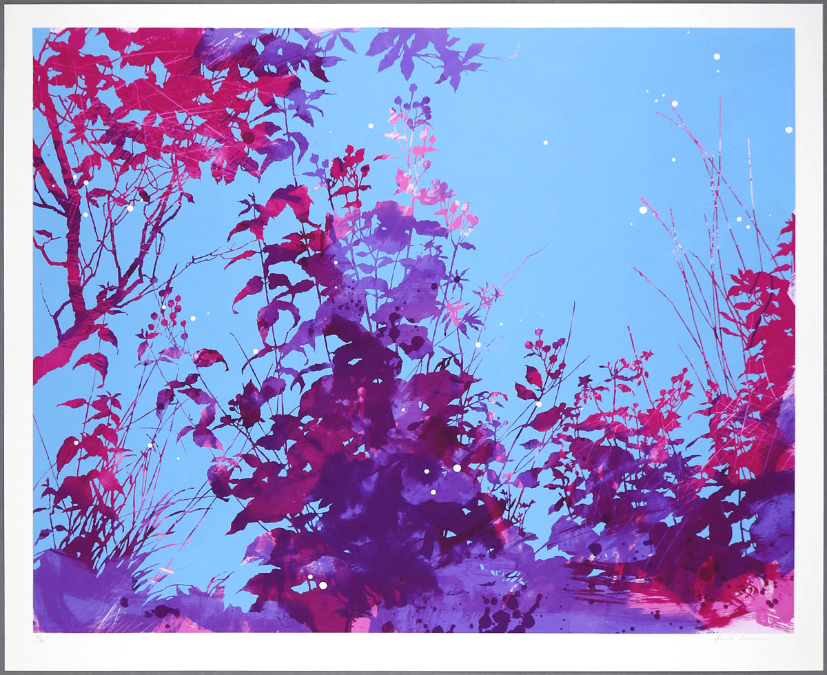
Magenta, 2015
Edition of 60
6 Artist Proof (APs)
108(w) x 88(h) cm
42.52(w) x 34.65(h) inches
HENRIK SIMONSEN
Magenta, 2015
Edition of 60
6 Artist Proof (APs)
108(w) x 88(h) cm
42.52(w) x 34.65(h) inches
|
|
|
108(w) x 88(h) cm
42.52(w) x 34.65(h) inches
|
7 colour screenprint on Somerset 410gsm paper.
Signed and numbered on front.
Edition of 60
|
|
The series starts as the long-awaited spring turns into summer.
Magenta depicts the early summer dabbled in the cool light of the mornings; nettles, thistles and other wild grasses are already growing tall, while some trees hesitantly have left some buds unopened, leaving the lower branches bare. The darker magenta and purple hues are the silhouettes of the flora, set against the blue sky before the sun rises above the horizon. A few weeks later, the summer is upon the landscape in
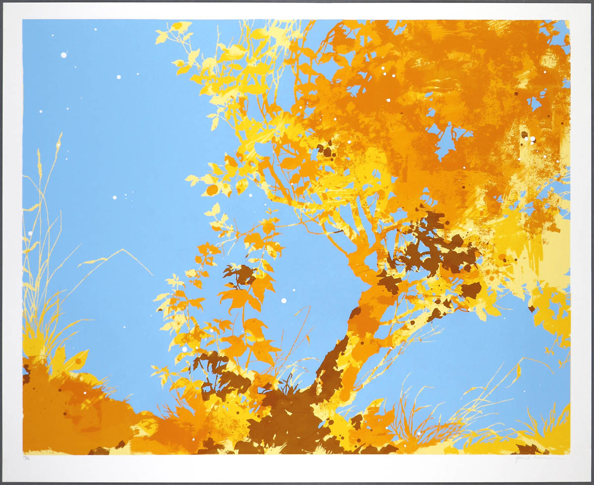
Ochre. Trees are in full vigour, absorbing the energy from above and cascaded in golden, almost rusty, warm light from the ground up. Contrary to
Magenta, where the source of the light in the artwork comes from behind, the blue sky in
Ochre is reversed to a backdrop as the sun reaches its highest point.
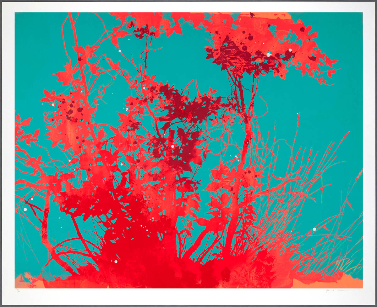
Scarlet represents the end of summer and reveals the last growth of plants and trees before they reverse for autumn and winter. Leaves are bitten by insects and twisted, torn and entangled by the weather, presenting the plants at their most sculptural. As the sun slowly sets, the late summer afternoon light is strangely intense, reflected on the foliage as a scarlet red colour, and set off by a sky that gradually grows cooler in hue. Bringing a close to the series, Scarlet is a celebration of all the season’s richness and intensity.
HENRIK SIMONSEN
Scarlet, 2014
Edition of 60
6 Artist Proof (APs)
108(w) x 88(h) cm
42.52(w) x 34.65(h) inches
HENRIK SIMONSEN
Scarlet, 2014
Edition of 60
6 Artist Proof (APs)
108(w) x 88(h) cm
42.52(w) x 34.65(h) inches
|
|
|
108(w) x 88(h) cm
42.52(w) x 34.65(h) inches
|
7 colour screenprint on Somerset 410gsm paper
Image size 100 x 80 cm
Signed and numbered on front.
To see larger and more detailed image (2Mb file opens in new window), please click here
Edition of 60
|
|
Created over a period of six months, the three works on paper are significant in Simonsen’s practice and represent a period of change in his personal life which influenced his themes and styles. His move to Berlin in the summer of 2013 came after living more than a decade in Brighton, an artist hotspot an hour south of London. Packing a life into boxes often carries a mix of nostalgia and the anticipation of a new start; an energy Simonsen transformed onto paper. The impact on his works from the geographical reshuffle inspired a new body of work bare of the recognisable details and complexity of the earlier creations. Instead, colour took over as accentuated by the titles of the print editions.
In this novel series, Simonsen worked with a restricted palette as narrow as two or three main colours, from where he broadened them into other related vibrant hues. The visible details of these serigraphs are appearing indirectly from the scratches and expressive marks on each manual layer of colour and adds a sense of motion to the scenery. This method is vastly different to his previous and more recent works, where details are intentionally defined through attentive drawing and mark making.
At first glance, they may appear as an unassuming abstract journey within the artist’s preferred botanical subject, but behind the works lies a wealth of new inspirational sources. Partly inspired by the colour theory and fairy tale narrative by Goethe, the 18th century German poet and scientist, Simonsen examined the unique emotional impact that colour has on the viewer, without faring into a scientific study. A subject the artist is far too poetic. Other influences, such as the use of white dots that creates a sense of depths to the layers in the landscapes, are suggestive of John Baldessari; an American conceptual artist who used circular dots on his photographic works for a similar reason.
HENRIK SIMONSEN
Ochre, 2015
Edition of 60
6 Artist Proof (APs)
108(w) x 88(h) cm
42.52(w) x 34.65(h) inches
HENRIK SIMONSEN
Ochre, 2015
Edition of 60
6 Artist Proof (APs)
108(w) x 88(h) cm
42.52(w) x 34.65(h) inches
|
|
|
108(w) x 88(h) cm
42.52(w) x 34.65(h) inches
|
7 colour screenprint on Somerset 410gsm paper.
Signed and numbered on front.
Edition of 60
|
|
Magenta,
Ochre and
Scarlet were released between October 2014 to March 2015 and marked a continuation of the collaboration between
Henrik Simonsen and Eyestorm starting with the Blue and Orange. The year after, Simonsen revisited the idea of displaying the interaction between light, colour and reflection. Consisting of four prints, the
Sloe series (2016) directs the viewer through the progression of daylight as it besieges a single sloe tree during a long summer’s day in Denmark; from the morning orange sunrise, through to the darkening blue hour that stretches past midnight. Each print edition is a manually layered screenprint in editions of 60, signed and numbered on front.
You can find more information about the three screenprints and see the editions in more details on
Henrik Simonsen’s artist page
here.